I've never been one to be very picky about the colors of my prints. Of course, I like things to print the way I see them on my screen, but I've never been known to throw a fit if the color is a tiny shade off. I don't have my monitor or my printer custom profiled. I've hand calibrated my monitor with a free program called the Monitor Calibration Wizard (http://www.hex2bit.com/). My printer uses the default paper profiles. I haven't gotten worked up about the limitation of different color spaces. I work all my photos in sRGB, and don't really see the point in working in color spaces which cannot even be displayed on my monitor. The only time I change color space is when getting a photo ready to print at Costco.
Well, lately I've been running into a few cases where the colors I've printed weren't very satisfying to me. However, don't go thinking I'm about to start jumping into all of the above mentioned color space hysteria. And certainly don't think this is going to be the time for you to send me an email trying to convert me to working in aRGB or PhotoPro color spaces. Nope...my problem here stems from the inability of printers to handle even the entire sRGB color space.
A few weeks ago, I was working on printing the following photo: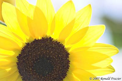
This sunflower was backlit by the sun, giving some very bright and vivid yellow colors. I thought this photo would be perfect for enlargement, so I printed up a 7"x11" print of it and was horrified. Several of the bright yellow spots in the petals came out with a horrid greenish tint. Not something very subtle, either. It was pretty significant and easily noticeable. Well, I realized right away I was printing outside the gamut of my printer (a Canon i960), so I played around with various color correction settings. I was able to at least eliminate most of the greenish tint (it's still there a tiny bit, but you have to look carefully), but in the process I've lost a bit of the vibrance of the yellows. I wasn't entirely happy with the results, so I've set that photo aside to work on others.
Well, just this weekend, I decided there was another flower photo I liked...this one from my trip to Holland, Michigan last year: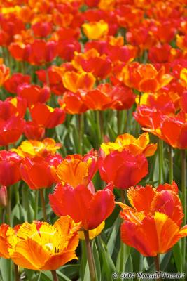
This time, I thought that was an excellent photo and would look better even larger...larger than my printer can go. So, I decided to send it out to be printed up at Costco in a 12"x18" size. When I went to convert to the Costco profile just before saving and uploading the file, I ended up with some horrid colors. Thinking there must have been something wrong with my system (I've made some software changes since the last time I printed at Costco), I went ahead and sent in the print anyway. When I picked it up, the colors were just as bad as they were on my screen. Luckily, this photo was well within the range of my i960, and I was able to print it up in a 7"x11" size with little trouble.
Perhaps someday we'll be well off, with pigment based printers that can cover the entire PhotoProRGB colorspace (and monitors that can display all those colors). For now, I'll have to be content with what's available, and be reminded every now and then of the confines of current technology. However, I'll also be reminded (as I was this weekend) of how the confines of technology are always expanding, as is the case when comparing modern inkjet printers to traditional photographic minilabs.
Tuesday, February 14, 2006
Hitting the limits of printer color spaces.
Subscribe to:
Post Comments (Atom)


No comments:
Post a Comment