I've never been one to be very picky about the colors of my prints. Of course, I like things to print the way I see them on my screen, but I've never been known to throw a fit if the color is a tiny shade off. I don't have my monitor or my printer custom profiled. I've hand calibrated my monitor with a free program called the Monitor Calibration Wizard (http://www.hex2bit.com/). My printer uses the default paper profiles. I haven't gotten worked up about the limitation of different color spaces. I work all my photos in sRGB, and don't really see the point in working in color spaces which cannot even be displayed on my monitor. The only time I change color space is when getting a photo ready to print at Costco.
Well, lately I've been running into a few cases where the colors I've printed weren't very satisfying to me. However, don't go thinking I'm about to start jumping into all of the above mentioned color space hysteria. And certainly don't think this is going to be the time for you to send me an email trying to convert me to working in aRGB or PhotoPro color spaces. Nope...my problem here stems from the inability of printers to handle even the entire sRGB color space.
A few weeks ago, I was working on printing the following photo: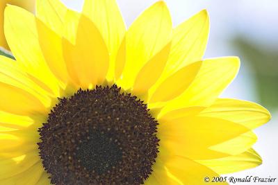
This sunflower was backlit by the sun, giving some very bright and vivid yellow colors. I thought this photo would be perfect for enlargement, so I printed up a 7"x11" print of it and was horrified. Several of the bright yellow spots in the petals came out with a horrid greenish tint. Not something very subtle, either. It was pretty significant and easily noticeable. Well, I realized right away I was printing outside the gamut of my printer (a Canon i960), so I played around with various color correction settings. I was able to at least eliminate most of the greenish tint (it's still there a tiny bit, but you have to look carefully), but in the process I've lost a bit of the vibrance of the yellows. I wasn't entirely happy with the results, so I've set that photo aside to work on others.
Well, just this weekend, I decided there was another flower photo I liked...this one from my trip to Holland, Michigan last year: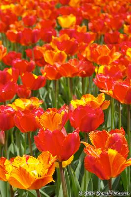
This time, I thought that was an excellent photo and would look better even larger...larger than my printer can go. So, I decided to send it out to be printed up at Costco in a 12"x18" size. When I went to convert to the Costco profile just before saving and uploading the file, I ended up with some horrid colors. Thinking there must have been something wrong with my system (I've made some software changes since the last time I printed at Costco), I went ahead and sent in the print anyway. When I picked it up, the colors were just as bad as they were on my screen. Luckily, this photo was well within the range of my i960, and I was able to print it up in a 7"x11" size with little trouble.
Perhaps someday we'll be well off, with pigment based printers that can cover the entire PhotoProRGB colorspace (and monitors that can display all those colors). For now, I'll have to be content with what's available, and be reminded every now and then of the confines of current technology. However, I'll also be reminded (as I was this weekend) of how the confines of technology are always expanding, as is the case when comparing modern inkjet printers to traditional photographic minilabs.
...click here to read more!
Tuesday, February 14, 2006
Hitting the limits of printer color spaces.
Wednesday, February 08, 2006
Multiple exposure on a DSLR - Part 2 - The Merge
Last week, I talked about the process of capturing images with your DSLR for the purpose of merging them into a multiple exposure. If you missed that, you can read part 1 here.
This time I'm going to talk about loading them into Photoshop and merging them together to create a single image. The general concept will apply just as well to other photo editing programs (ex: Paint Shop Pro), but the required steps and terminology may vary a bit.
For the purposes of demonstration, I'm going to work with a few different flower sequences I took recently. Whether or not these sequences make a good multiple exposure is not the issue, so please don't look at the sample I'm providing, say "Ick...why would I want to do that" and then walk away thinking multiple exposures is a waste of your time. The idea is to show you how to do it, and then you figure out the subject matter and camera technique which gives result that you like.
The Source Images
The first thing you need to do is load in your source photographs. For the first demonstration, I'll merge 4 photos. Below is a collage of the 4 images...just a couple of flowers shot with some vertical movement.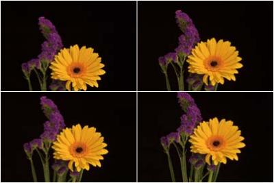
Next you need to get all 4 of these photos into one image as separate layers. You'll want to create a new image with the same width and height as the existing image. Then you want the windows to "Tile Horizontally" (on the Window menu) so that you can see all the images at once. Select the move tool (press V on the keyboard). Now, one image at a time, you want to select each window, hold the shift key, click in the center of the window, drag the cursor to the destination window (the empty one you created a moment ago), release the mouse button, then release shift. Repeat this process for each of the other windows. This will copy each image into a new layer in the combined image.
Finally, you just need to figure out which way you want to merge the images together. There are several techniques you can use, but I'll show you 3 that work decently.
Average Blending
Here, the idea is pretty simple...average the pixel values between layers. Since photoshop doesn't have any built in blending to do such a thing, you'll need to do this using layer opacity. Starting from the bottom most layer, you want to calculate each layer's opacity by the following formula:
Opacity = 100 / (1 + [number of layers below this layer])
When you do this, the bottom most layer will be 100% opacity, the next layer 50% opacity, then 33% opacity, and finally the topmost layer will have 25% opacity. This may seem odd, but mathematically, it works out. The top layer contributes 25% of the image, and the remaining 75% is contributed by the lower 3 layers. Of that 75%, the second layer contributes 33%, which gives you 33% of 75% = 25% contribution to the final image, with the other 50% contribution shared between the 3rd and 4th layers. Layer 3 does 50% of 50%, which is again 25%, and the remaining 25% is contributed by the bottom layer (100% of 25% = 25%).
Here is what the result looks like: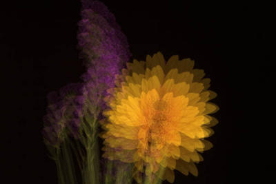
I tend to like this method the best. It's not too complex (as long as you can remember the opacity levels: 100%, 50%, 33%, 25%, 20%, 17%, 14%, 12%, 11%, 10%). The colors tend to stay pretty accurate (blending red on red will give you the same shade of red). The results tend to be closest to what I would expect from a traditional multiple exposure.
Underexposed Screening
With this technique, you leave the opacity of each layer at 100%, but instead, you do 2 things. First, you reduce the exposure of each image using the Image->Adjustments->Exposure menu, then you change the blending mode for all layers EXCEPT the bottom layer from Normal to Screen (you do this in the Layers window). The number of stops to reduce the exposure of each image depends on how many images you are blending. When blending 'x' number of images, the exposure needs to be reduced log2(x). If you aren't familiar with calculating logarithms or don't have a scientific calculator handy, here is the amount to reduce exposure for different numbers of images:
2 images => 1 stop
3 images => 1.6 stops
4 images => 2 stops
5 images => 2.3 stops
6 images => 2.6 stops
7 images => 2.8 stops
8 images => 3 stops
9 images => 3.2 stops
10 images => 3.3 stops
Here are the results of blending these 4 images: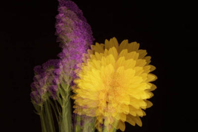
This technique can give some interesting results, but I find it tends to wash out the colors a bit, especially on relatively light colors (where they'll quickly wash out to white). One side effect of the colors being washed out is that you colors can change shades. I'll demonstrate both of these problems later in my second example.
Opacity Screening
A third way to blend the images is to combine opacity and screen blending. First, you need to start with a black background, so create a new layer, fill it with black, then choose Layers->New->Background from Layer. Next, set all the image layers to Screen blending. Then set the opacity on each layer to 100%/[number of images]. The resulting image will be a bit faded, so the final step is to select the topmost layer, then select Layers->New Adjustment Layer->Levels, and in the resulting dialog, grab the rightmost of the three markers and drag it to the right edge of the histogram.
Here is the result: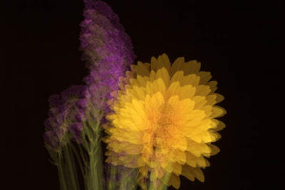
As you can see, this doesn't look a whole lot different than Average Blending. The differences are quite subtle, and you could probably be just as happy substituting one method for the other. My only point in showing this method is to demonstrate another way to achieve blending, to get your creative ideas flowing. If you take this same technique but adjust the opacities and then readjust the Levels layer you can achieve different effects
Example 2 - Blending 9 Images
In this example, I took a series of 9 photographs of some other flowers. In between each shot, I did 2 things. First, I turned the camera very slightly clockwise. Second, I zoomed in a tiny bit more each time. The first photograph was zoomed to about 41mm, and the last shot was about 52mm.
The 9 source images: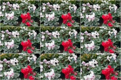
...blended with Average Blending: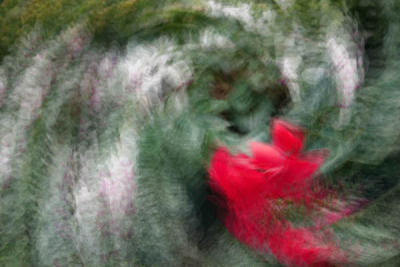
...with Underexposed Screening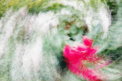
...and with Opacity Screening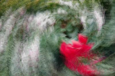
Here you can definitely see the problems I was mentioning with the underexposed screening. The image is much more washed out...way too much white. In addition, the rich red color has shifted to a hot pink. Although, in this case, since we are creating something abstract, that might end up being exactly the effect you are looking for. There is definitely no wrong way to do it...it's all about being creative.
Unequal Blending
The above examples all demonstrate equal blending, where all layers have an equal contribution. Another variation would be to adjust the layers (either their exposure or their opacity) to give emphasis to one layer over the others. Or instead of giving emphasis to just one layer, you could give increasing emphasis to each additional layer...sort of like a motion blur trail which is fading out.
There are plenty of different ways you can experiment with multiple exposures. It's really all up to your creativity. Forget about having any rules and just have fun instead. If you play around enough, you are bound to come up with something interesting and unique. Good luck.
...click here to read more!


